SECOYA by the Park
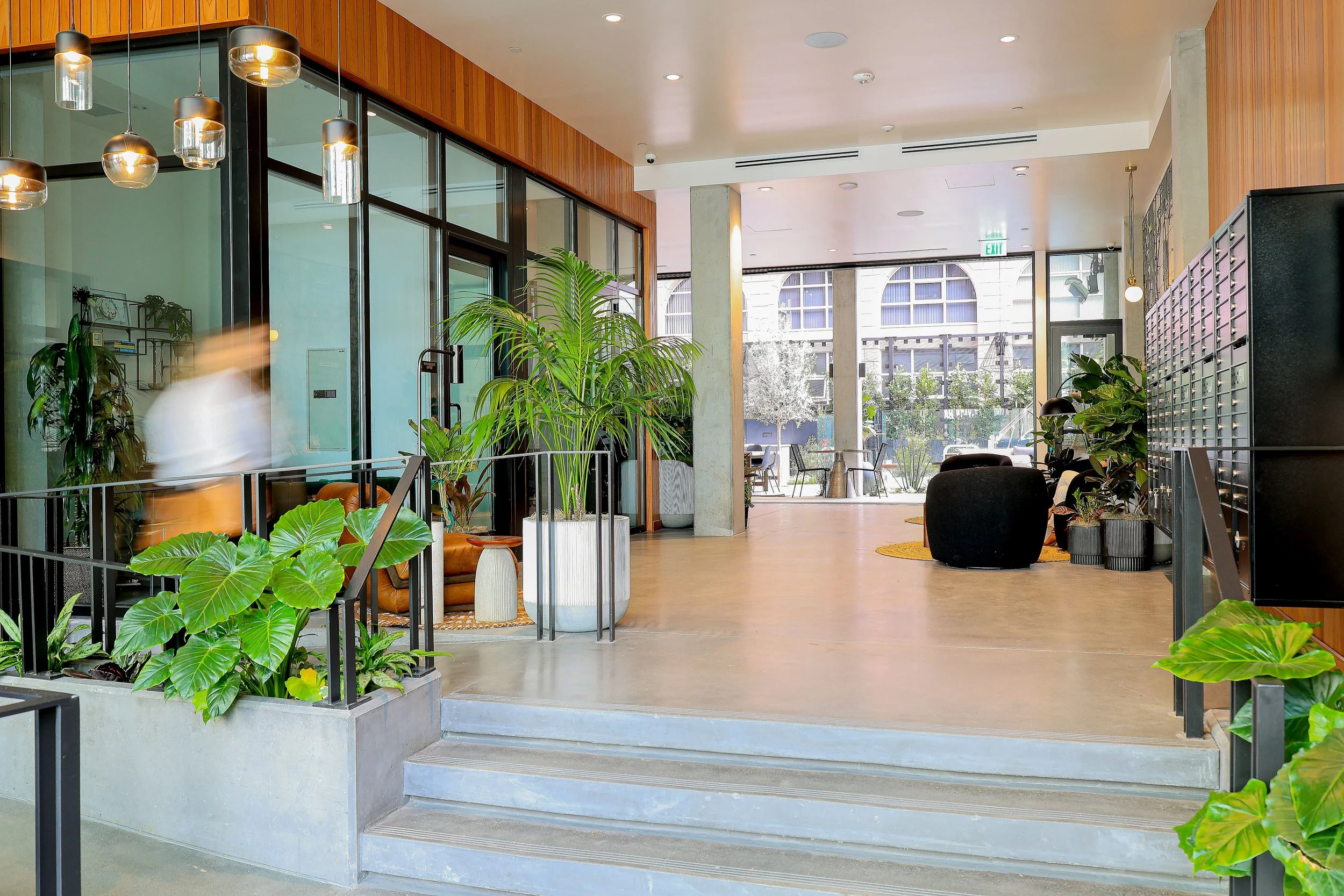
Less than one block from Balboa Park sits a boutique hotel style 112 unit mid-rise, multifamily project that blurs the lines between indoors and out.
Sometimes a brand identity reveals itself simply based on it’s surroundings, in this case, directly influenced by it’s proximity to Balboa Park.
Identity Design
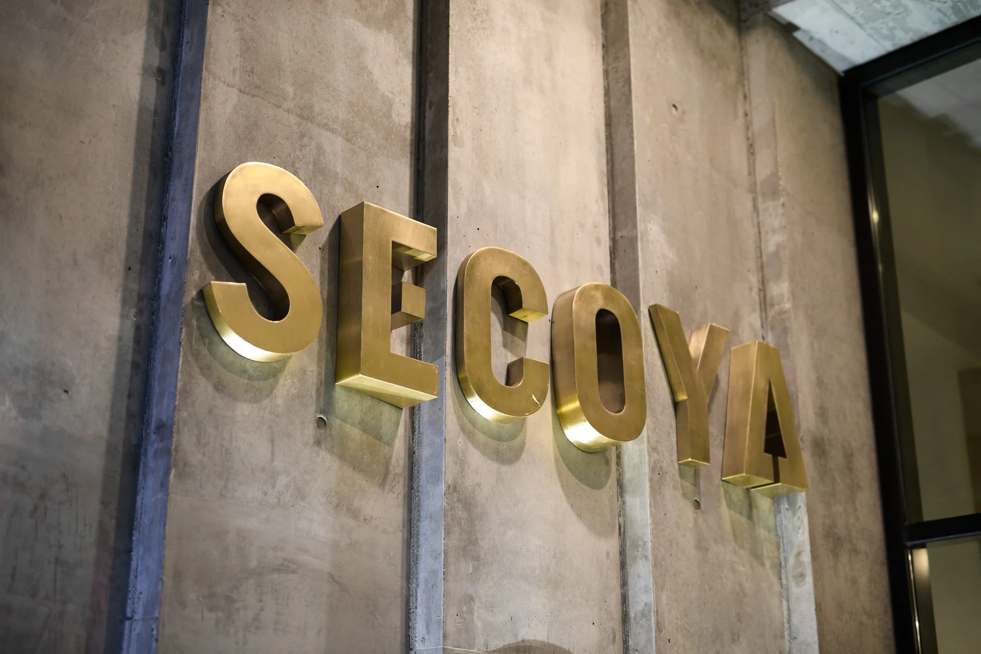
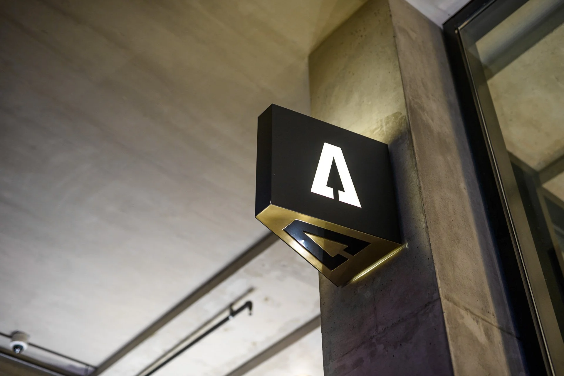
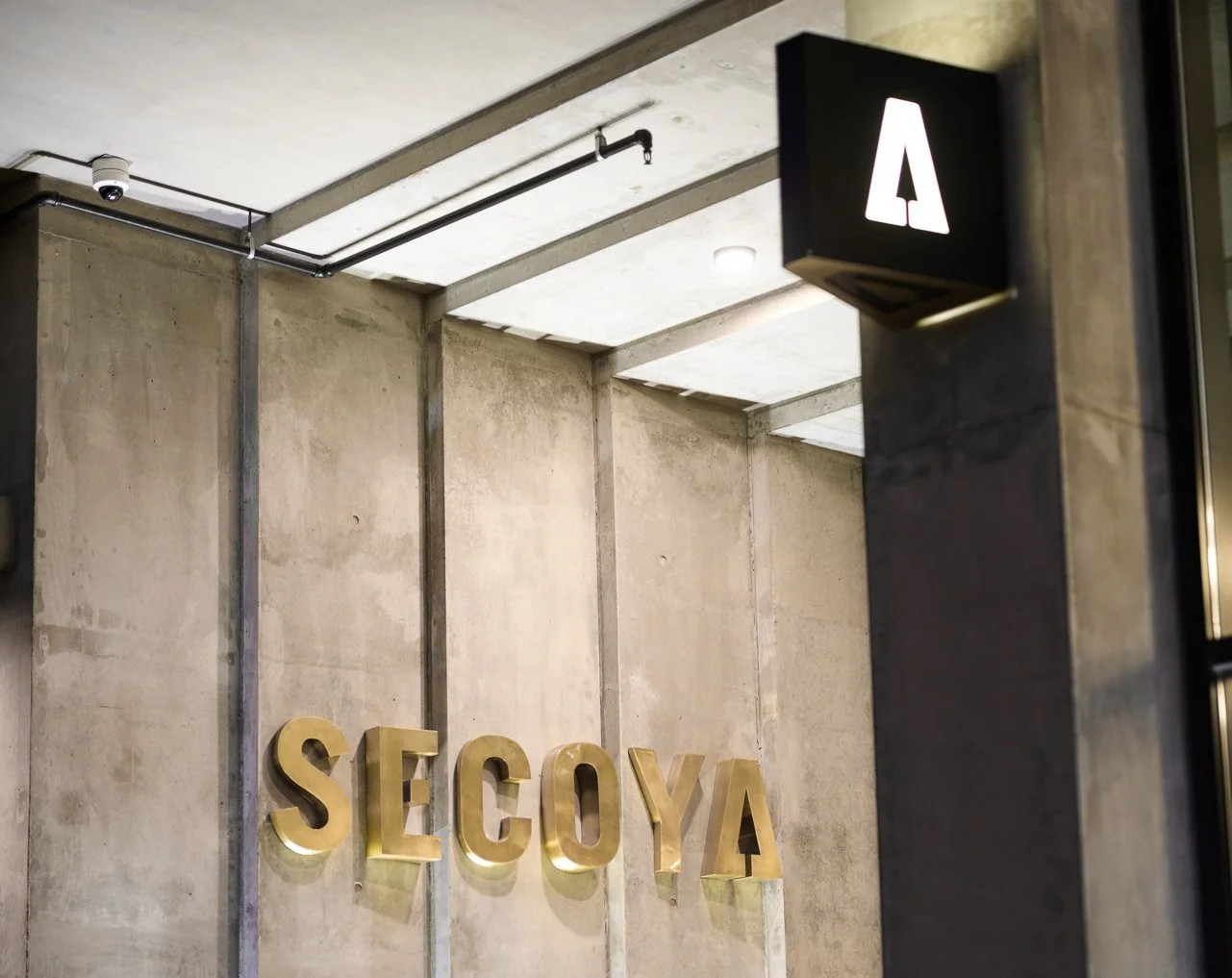
A unique take on sequoia and inspired by the indigenous spelling sequoya the wordmark for SECOYA was born from multiple property elements. The perfect square inside the “E” represents the perfect square evelope that the property sits on, while the tree hiding inside the A reflects not only the name, but the proximity to nearby Balboa Park.
Exterior Signage
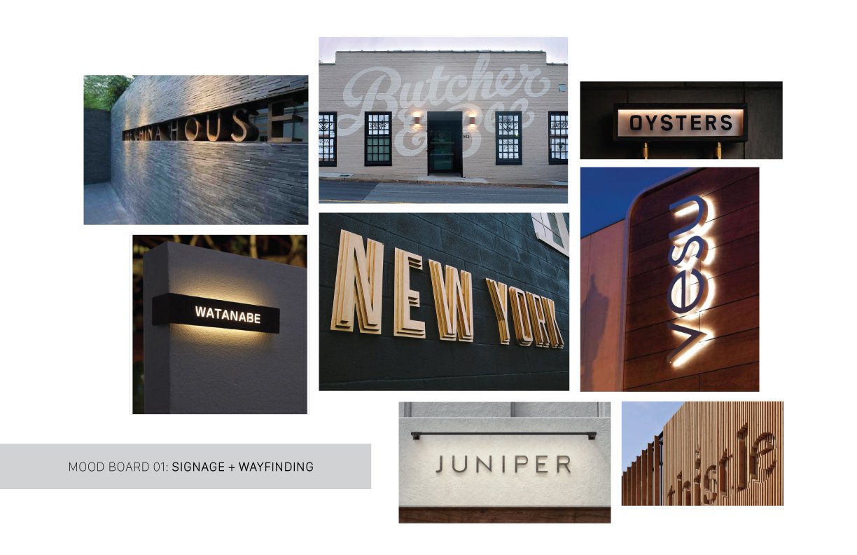
Monument signage can be a tricky thing. You have to balance design intention with not only the owner’s wishes but also the complicated building codes. In the end, we were happy with how the brass plated channel letters and blade signs turned out, a touch of class and sophistication while maintaining design integrity and code compliance.
Building the Brand
The identity design then began to inform all the other touch points and visual elements. We identified the time period that fit with Alice Rainford’s story— the early 1900s— and went from there. It was fun to explore the Art Deco and Art Nouveau movements and weave them into the Rainford brand.
It’s in the Details
-
![]()
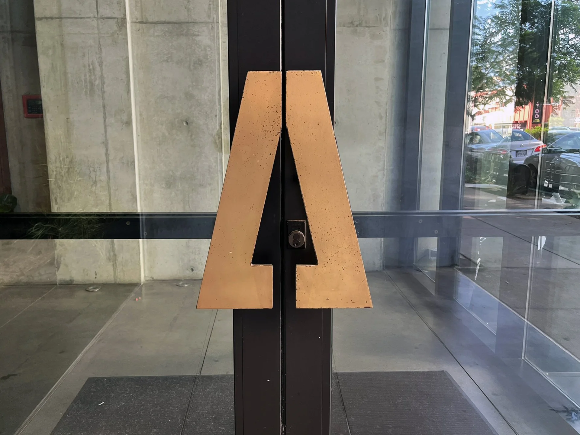
Custom Brass Plated Door Handles
This was a fun one. We worked with a local fabricator to translate the tree icon into custom door handle pulls.
-
![]()
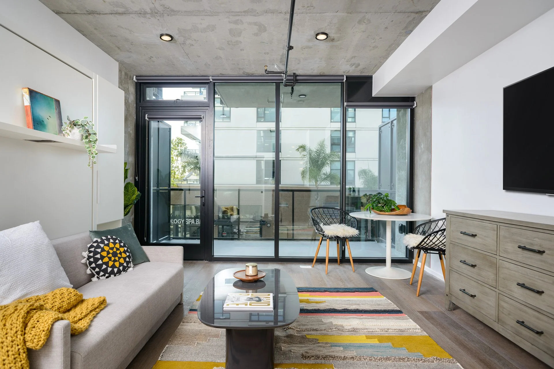
Unit Staging
Staging is an extension of the story. It should fit seamlessly into the brand identity and character of the building, giving new tenants an idea of what can be.
-
![]()
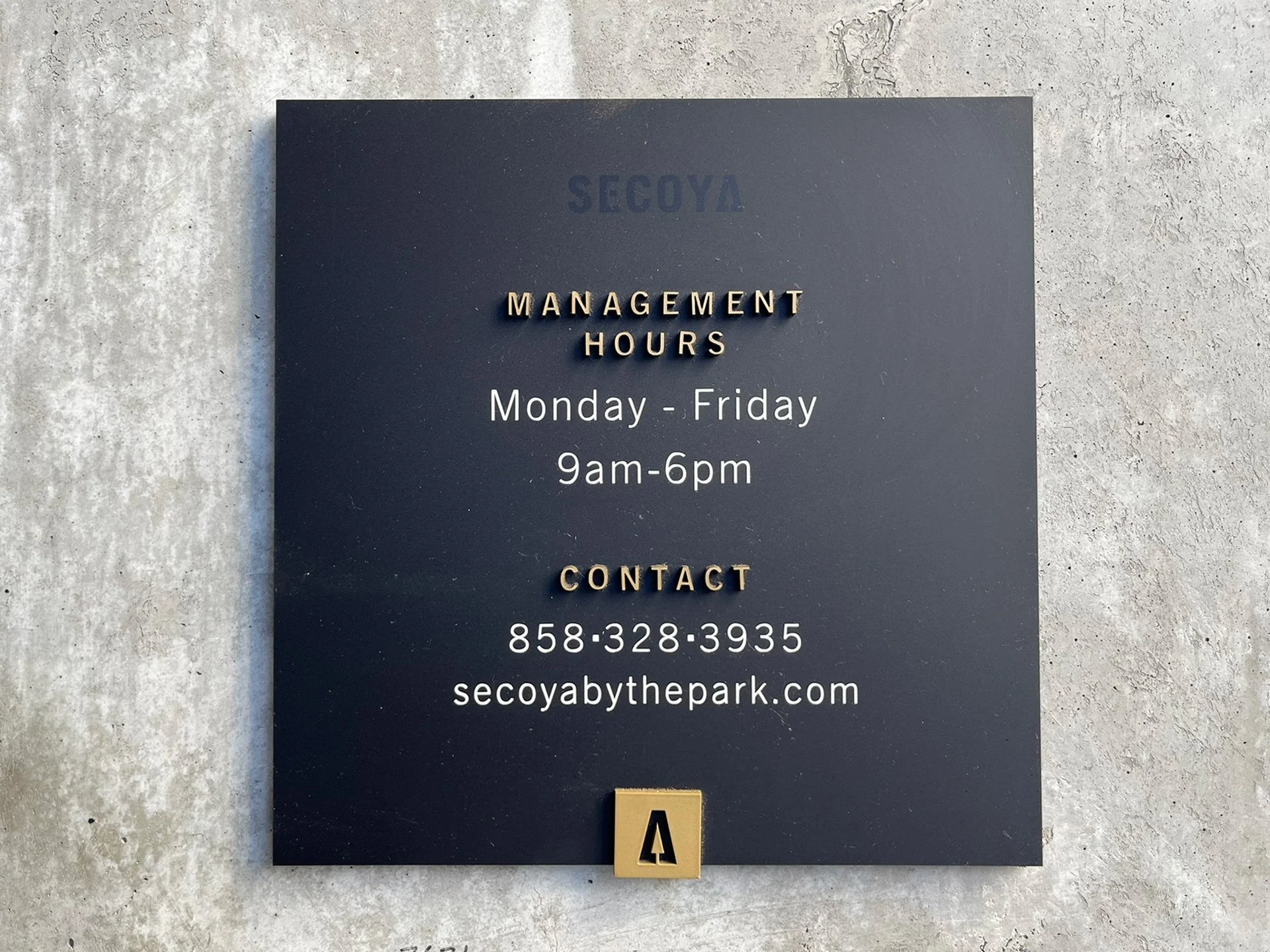
Wayfinding
From information to directionals, wayfinding signage is a key part of any multifamily project
-
![]()
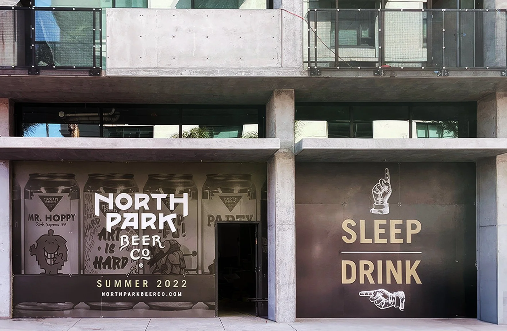
Hoarding Walls
Signage that’s playful and informative while remaining “on brand” is an important element during the pre-lease up phase of any project.